
Yield Curve Normalization: Good or Bad For S&P?
Today's note offers equity investors critical insights into how the yield curve's normalization could impact the S&P. While this research was first released to our paying subscribers a month ago, its findings remain highly relevant for today's market. Our subscribers acted early, and you can too. Join them to receive timely research before the crowd and position yourself for future opportunities by starting your free trial today.
Highlights
- Like the prospect of a recession, the recent yield curve normalization has Fin-Twit all a-buzz. Predictably, the chart showing how the market plunged after the last two rate cut cycles is making the rounds.
- While it is factually true that the market tanked after the last two easing cycles got underway, it is highly incomplete analysis, and therefore misleading. We fill in the missing parts in this article.
- As one can imagine, the stock market responds quite differently than GDP does to yield curve normalizations. This is because the market is forward looking, so let’s look forward, shall we?
- In the end, all that really matters is what the market is doing TODAY, since that reflects all that is known about the present and is as good a read of the future as you’re going to find.
- With our Risk Gauges in “Risk On” across all three timeframes, we understand the market’s message to be that better times lie ahead.
Yield Curve Normalization: Good or Bad For S&P?
The yield curve in the US has finally normalized back to positive levels. This means that after a record period during which the 2-year treasury yield was above the 10-year treasury yield, it has finally fallen back below, or “normalized”.
With this, Fin-Twit is falling all over itself to point out how the market plunged after similar normalizations in the past. They specifically site 2000 and 2007 as their examples (red arrows in chart below), which are undeniably periods of rather negative market action following yield curve normalizations. (Note: the blue line is the S&P. Orange indicates the yield curve is inverted, so when it goes from orange, back to blue, the yield curve normalized.)
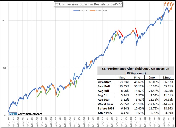
The problem is that this analysis is not only incomplete, but it is also misleading. Going back to that 1960s, we see a completely different picture, one in which the market actually responded very bullishly to yield curve normalizations (green arrows)!
There were a few normalizations that were followed by weakness, then strength, or vice versa. This includes the COVID period (right most blue arrow), when net-net, the response was neutral.
To cut to the chase, the table inset in the chart above shows the summary stats of the S&P’s response to all normalizations since the 1960s. In the middle of the table is the average market response over the subsequent 3-, 6-, 9-, and 12-month periods (“Avg All”), all of which are quite bullish. In the instances when the response was bullish (“Avg Bull”, one row higher), it was spectacularly so. The same can be said of the bearish responses (“Avg Bear”, one row lower).
Ultimately, the line in the sand can be drawn between pre-and post 1995, when the threat of deflation really began to spread around the globe. I have postulated this idea in prior notes and videos, but my thinking is that between the 1960s and late 1990s, the Fed was fighting inflation, so whenever they normalized the yield curve by cutting rates, they signaled that they felt they had beaten inflation (otherwise why cut rates?). This is of course good for stocks, and the market responded accordingly (see the “Before 1995” row in table above).
However, at some point around the late 1990’s the Fed began to focus on fighting deflation . Under those circumstances, whenever they normalized the yield curve by cutting rates, they were signaling that another wave of deflation was possible (darn good reason to cut rates!). This, of course, is bad for stocks, and the S&P responded with below average returns (see “After 1995”).
So, same Fed action–cut rates–yet completely different market response, depending on the inflation/deflation regime at the time. If it is correct to think that we have beaten deflation in this post-COVID world, and that the Fed is now focused on containing inflation , my expectations lean more in the direction of the S&P responding favorably to the recent normalization.
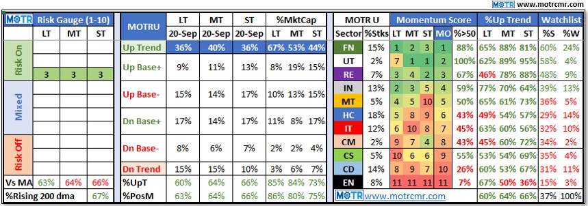
Of course, as I stressed in the September 9th Weekly MOTR Report, titled “ We Buy & Sell Stocks, Not GDP. “, all that really matters is what the market thinks now . As highlighted in this week’s Weekly MOTR Report ( here ), our Risk Gauges have all inflected to “Risk On” across all three timeframes (see table above). While this by no means suggests that the market will just blast off from here, it can be said that a broad bull market is impossible without this condition.
Ultimately, what it really means though is that our long-standing strategic view of “fully invested, buy weakness if we get it” has simply been fortified. Whatever I, you, or anyone else thinks about the prospects for the economy in the next year, the market has already processed all of that and is looking forward to the next datapoint, which could be anything.
Hence, stay in line with the present message of the market (Risk Gauges), and make moderate changes at the margin when that data changes. I don’t know of a better way of operating in an uncertain world such as this.