Private Capital Investments
March 07, 2019
Private Capital Investments is a real estate lender providing privately funded loans for fix & flip, renovation, business, construction and land projects in California and neighboring states.

San Francisco Bay Area Housing Report for March 2019

On a monthly basis, Private Capital Investments ( www.privatecap.net ) provides an overview of the metropolitan San Francisco Bay Area housing market. This assessment includes a quantitative and qualitative review of the home sales metrics provided by Redfin. We closely review both long term and short term interest rates to review their impact to the market.

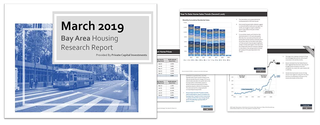
For the reporting month of February (based on month ending January 2019 data), our reports indicate generally positive signs based on the number of homes sold, compared to the momentum of the national average. Please see the detailed report included in this post for a full overview.

The report summarizes a likelihood that upward momentum is generally expected to continue, albeit at a reduced rate. We see a 72% likely hood that positive result will take place.

March 2019
Bay Area
Housing
Research Report
Provided By
Private Capital Investments
Table of Contents
2
This report provides an analysis of real
estate activity
based on the most recent
Redfin home sales data for the Metropolitan
San Francisco, CA area gathered from
www.redfin.com. This report includes
analyses and commentary provided as a
courtesy by Private Capital Investments.
Private Capital Investments offers Refinance,
Acquisition and Construction Loan Programs
for Land, Residential and Commercial
Properties.
Joseph McDonald
Business Development
Private Capital Investments
www.PrivateCap.net
joseph@privatecap.net
(925) 718
-
6212
Slide
Page
Disclosures
3
Home Sales Summary
4
Home Sales Summary vs. National
5
Year To Date Home Sales Trends
6
Year To Date Home Sales Trends (Second Look)
7
Adjusted Look At Home Sales Trends
8
Annual Trends of Homes Sales & Prices
9
Spread Between Inventory and Homes Sales
10
Snapshot of the California Economy
11
Bay Area Home Prices vs. REIT Equity Prices
12
Trend in Mortgage Default Rates
13
Health of Mortgage Backed Securities
14
Review of Mortgage Interest Rates
15
Credit Risk Spreads
16
Historical Impact of Interest Rate Spikes
17
Using Capital Markets To Forecast Home Prices
18
CME Fed Funds Futures Curve
19
Western Region Housing Building Permits
20
National Household Debt Service Ratios
21
Total Real Estate Market Sentiment Report
22
Contact Us & Key Links
23
Bonus Slide
24+
Disclosures
3
Data
provided
by
Redfin,
a
national
real
estate
brokerage
www
.
RedFin
.
com
.
The
information
and
opinions
presented
in
this
document
have
been
prepared
internally
and/or
obtained
from
sources
which
Private
Capital
Investments
(PCI)
believes
to
be
reliable,
however
PCI
does
not
guarantee
the
accuracy,
or
completeness
of
such
information
.
Opinions
expressed
reflect
market
conditions
at
the
time
that
this
material
was
completed
and
are
subject
to
change
.
Home Sales Summary
# Home Sales
2014
2015
2016
2017
2018
2019
% Change
(’18 to ‘19)
January
696
567
589
552
507
484
-
4.54%
Year
-
To
-
Date
696
567
589
552
507
484
-
4.54%
Last 12
13224
12360
11639
11104
11353
11098
-
2.25%
4
Median
Home Price
2014
2015
2016
2017
2018
2019
% Change
(’18 to ‘19)
January
886
927
1050
1050
1300
1233
-
5.15%
Year
-
To
-
Date
886
927
1050
1050
1300
1233
-
5.15%
Last 12
844
954
1124
1159
1279
1385
8.28%
Days On
Market
2014
2015
2016
2017
2018
2019
% Change
(’18 to ‘19)
January
22
24
26
47
25
42
68.00%
Year
-
To
-
Date
22
24
26
47
25
42
68.00%
Last 12
15
16
16
24
18
20
10.55%
Data provided by Redfin, a national real estate brokerage.
For the month of January, Bay
Area home sales were similar
to the same period last year
with around 500 homes sold.
Over the rolling 12 month
period, the figure was also
very similar overall to previous
years.
Median home prices where
similar overall, with the
exception of the ‘last 12’
metric, which takes into
account the rolling 12 month
average. Another important
observation is the Days on
Market metric, which shows it
took much longer to sell
homes in the period compared
to the previous year. We don’t
believe that this is a broader
weakness indication however.
Positive Sign
Bay Area
Home Sales Summary vs. National
# Home Sales
2018
2019
% Change
January
507
484
-
4.54%
Year
-
To
-
Date
507
484
-
4.54%
Last 12
11,104
11,353
2.24%
5
Median
Home Price
2018
2019
% Change
January
1,300
1,233
-
5.15%
Year
-
To
-
Date
1,300
1,233
-
5.15%
Last 12
1,279
1,385
8.28%
Days On
Market
2018
2019
% Change
January
25
42
68.00%
Year
-
To
-
Date
25
42
68.00%
Last 12
18
20
10.55%
2018
2019
% Change
195,435
185,063
-
5.31%
195,435
185,063
-
5.31%
3,182,910
3,116,965
-
2.07%
2018
2019
% Change
278
285
2.52%
278
285
2.52%
284
298
4.88%
2018
2019
% Change
56
57
1.79%
56
57
1.79%
47
44
-
6.69%
Bay Area
National
On a national level, home sales
where down slightly compared
to the year before. That said,
home prices were slightly
higher which was a
continuation of the existing
trend and we believe a
reaffirmation of overall
nationwide health in housing.
It is interesting that the
number of homes sold is up
almost 5% on the ‘last 12’
metric, which shows there
continued strength and
consistency in national home
sales and prices.
While the Bay Area saw a
uptick in the time it takes to
sell homes, the national
average generally remained at
its current levels.
Data provided by Redfin, a national real estate brokerage.
Positive Sign
Year To Date Home Sales Trends
6
Bay Area home sales figures for January were
generally in line with previous years during the
same month.
It should be noted that we have seen two
consecutive months where readings were lower
than previous year comparisons. We will watch
closely to see if a new trend is established as a
result.
January is not often a predictor of overall home
sales results through the spring, so we’ll focus
our analysis on other metrics such as inventory
and median prices to try to gauge expectations
on the Bay Area housing for 2019.
Now that the year of 2018 has been closed, we
can reflect on the increased levels of home sales
volatility that accompanied higher prices. We
will pay close attention to any type of unique
data points that might be associated with a
market at its peak.
Data provided by Redfin, a national real estate brokerage.
Neutral Sign
Jan
Feb
Mar
Apr
May
Jun
Jul
Aug
Sep
Oct
Nov
Dec
2015
567
664
1012
1115
1079
1182
1127
985
931
1055
885
1015
2016
589
601
859
945
1050
1153
993
1039
947
1029
1016
920
2017
552
570
966
920
1132
1234
1008
1031
881
1134
1095
875
2018
507
658
1018
1016
1214
1148
1012
961
767
1137
958
725
2019
484
200
300
400
500
600
700
800
900
1000
1100
1200
1300
Number of Homes Sold in SF Bay Area
Month
-
By
-
Month Home Sales History
Year To Date Home Sales Trends (Second Look)
7
This chart allows us to visually identify the
cumulative monthly sales trends going back to
2013 year
-
by
-
year.
Since overall housing indicators suggest an
upcoming good market, per our report last
month, we struggle to imagine a 2019 that
doesn’t look similar to the years of 2015
through 2018.
In our previous reports, we have noted the
general downward annual pattern in this
particular graphic. Most Bay Area real estate
professionals will keenly point out that an
inventory constraint as the primary culprit for
this down
-
trend. What is not clear just yet is
how any type of significant change in trend
could happen in the short
-
term.
We will turn our focus to inventory in the
coming months to further get a grasp on the
upcoming trends in the market.
Data provided by Redfin, a national real estate brokerage.
690
696
567
589
552
507
484
738
738
664
601
570
658
1,069
981
1,012
859
966
1,018
1,173
1,219
1,115
945
920
1,016
1,347
1,175
1,079
1,050
1,132
1,214
1,248
1,160
1,182
1,153
1,234
1,148
1,351
1,211
1,127
993
1,008
1,012
1,228
1,121
985
1,039
1,031
961
976
1,070
931
947
881
767
1,309
1,257
1,055
1,029
1,134
1,137
1,116
940
885
1,016
1,095
958
973
921
1,015
920
875
725
-
2,000
4,000
6,000
8,000
10,000
12,000
14,000
2013
2014
2015
2016
2017
2018
2019
Monthly Cumulative Residential Sales
Jan
Feb
Mar
Apr
May
Jun
Jul
Aug
Sep
Oct
Nov
Dec
Positive Sign
800
1000
1200
1400
1600
1800
2000
0
200
400
600
800
1000
1200
1400
1600
2013
2014
2015
2016
2017
2018
2019
Number of Homes Sold
Median Home Price
Time Adjusted Homes Sales Trends
# Homes Sales, Median Sales Price in Each 12 Month Period Charted Quarterly
Adjusted Look At Home Sales Trends
8
This chart provides a trend illustration of the
number of homes sold in the Metro Bay Area vs.
the Median Prices of homes that sold during
these time frames.
Each data point represents one calendar quarter
in order to smooth the charted data and reduce
volatility.
Over the past four years, we have seen a clear
decrease, albeit a marginal one in the pace of
homes sales.
We appear to be in a period of yet again rising
median home prices after a 18 month pause.
Despite this, we do not believe there is an
economic catalyst to carry prices higher over a
full 36 month consecutive period like the period
of 2012 to 2015.
The March 2019 update shows a potential
pause to the growth of the median price trend
that had previously stabilized into slow growth
2016 to late 2017. This data point is the first
firm downtick since early 2016. Sales, while still
in a downtrend, seem to have paused and
stabilized for the time being.
Data provided by Redfin, a national real estate brokerage.
Positive Sign
Annual Trends of Homes Sales & Prices
9
This graph provides an overall illustration of the
state of the Bay Area Housing market.
The trend of median home prices will reveal a
pause or possible reversal in the coming months
as the black line represents the average of the
period, so only one data point (one month)
represents 2019 so far. If there is indeed a
longer multi
-
month pause, it would be an
interesting contrast to the issue of inventory
constraints in the market. As long as inventory
remains a constraint, most believe it will be the
factor that keeps prices high.
As noted on the previous slides, we believe that
the economic environment is likely shaping to
repeat the last several years for the number of
homes sold in 2019.
Data provided by Redfin, a national real estate brokerage.
2013
2014
2015
2016
2017
2018
2019
Number of Homes Sold
13218
12489
11617
11141
11398
11121
484
Median Home Prices
829
951
1113
1159
1258
1390
1233
$0
$200
$400
$600
$800
$1,000
$1,200
$1,400
$1,600
0
2
4
6
8
10
12
14
16
18
20
Median Price of Homes Sold (K)
Cumulative Annual Number of Homes Sold
Thousands
Home Sales & Price Trends
Number of Homes Sold vs. Median Price
Positive Sign
Spread Between Inventory and Homes Sales
10
This graph, which is not adjusted for seasonality,
illustrates the trend of home inventory and the
number of homes sold over a 6 month period.
In the most recent update, we have observed
the number of homes listed as sharply lower in
their seasonal pattern of meeting demand,
represented by number of homes sold.
What is key to note here is the potentially
bottoming of the seasonable figure of homes
sold over a six month time frame. The
bottoming and gradual rising of the black line
indicates a potential strengthening pattern,
representing a period that might be similar to
2014 and 2015.
The most recent update shows that more
homes were listed than were sold within the
rolling six month time period. This is a
temporary deviation of course, but the length of
time is noteworthy to gauge the health of the
market.
Data provided by Redfin, a national real estate brokerage.
Neutral Sign
2000
3000
4000
5000
6000
7000
8000
9000
2013
2013
2014
2015
2016
2016
2017
2018
2019
Trend of Inventory of Homes vs. Number of Homes Sold
Number of Homes Sold Over Rolling 6 Month Period
Number of Homes Listed Over Rolling 6 Month Period
Snapshot of the California Economy
11
Each
month
the
Employment
Development
Department
releases
revised
and
preliminary
civilian
labor
force,
unemployment
rates,
and
industry
employment
by
geography
for
California,
metropolitan
areas,
counties,
and
sub
-
county
areas
.
The
last
data
released
was
for
December
2018
.
Source
:
,
https
:
//labormarketinfo
.
edd
.
ca
.
gov/,
California
statewide
unemployment
Rate
(Labor
Force),
Non
-
Seasonably
Adjusted
Unemployment
Rate
.
This graph illustrates the incredible trend
towards historically low employment numbers.
The slope of the decline of unemployment
claims is either a strong representation of how
healthy the economy, or perhaps a overzealous
growth environment that is prone to a slowing.
The economic conditions of the state have
seemingly not moved in a stable fashion looking
back to 1990; we don’t recognize any ‘straight
lines’ or horizontal moves on this chart. It
appears that the employment market is either
rapidly rising or rapidly falling at any given
moment.
As we create new 30 year lows, we suggest a
position of caution ahead as uncharted
territories can create unforeseen events and
market shocks and disruptions becoming an
eventuality.
It may be likely that the next period of weakness
will at least return us back to the 60 month
average, which at this moment is around 6%.
5 Year
Average
of 6%
4.10%
Current
Level
0%
2%
4%
6%
8%
10%
12%
14%
1990
1992
1994
1996
1998
2000
2002
2004
2006
2008
2010
2012
2014
2016
2018
State of California Unemployment Rate
Positive Sign
Bay Area Home Price Trend vs. REIT Equity Market Prices
12
This graph illustrates the trend of publicly
traded REIT prices measured by the S&P REIT
Index. The similarity in the starting index levels
is a coincidence.
The publicly traded REIT space provides us with
an insight to what equity market participants
believe forward projections/future values will
be for Real Estate. The upward trajectory
indicates that investors do not yet believe that
there will be any slowing of equity value
appreciation in the coming quarters. This means
that equity traders have not ‘priced in’ an
expected pull back in the housing market.
With Bay Area home prices moving downward
suddenly, we contrast this move with upward
strength in the REIT index. Given the strength in
the broader REIT space, we would suggest that
the recent home price move is not
representative of forward expectations as
measured by the prices of REITs currently.
We believe that the continued strength in REITs
suggest that we will see ongoing strength in the
home prices as well.
Data provided by Redfin, a national real estate brokerage. The S&P U.S. REIT Index defines and
measures the investable universe of publicly traded real estate investment trusts domiciled in
the United States. Equity data as of December 31
st
2018.
500
600
700
800
900
1000
1100
1200
1300
1400
1500
500
600
700
800
900
1000
1100
1200
1300
1400
1500
2013
2014
2015
2016
2017
2018
2019
S&P US REIT Index Value
Redfin
Bay Area Median Home Price
Bay Area Price Trends vs. REIT Equity Prices
Redfin Bay Area Median Home Price
S&P United States REIT
Positive Sign
Trend in Mortgage Default Rates
13
This index measures the default rates across first mortgages. It is included in the S&P/Experian Consumer
Credit Default Index Series which seeks to measure the balance
-
weighted proportion of consumer credit
accounts that go into default for the first time each month. This index measures the default rates across
second mortgages. It is included in the S&P/Experian Consumer Credit Default Index Series which seeks to
measure the balance
-
weighted proportion of consumer credit accounts that go into default for the first time
each month. Data updated through December 31
st
2018.
This graph illustrates the trend of decreasing
default rates for 1st and 2nd Mortgage Lien
positions.
We have changed this chart to focus on the last
10 years, rather than the last four years. Recent
questions about the implications of the mid
-
2017 increase in 2
nd
position defaults prompted
a need to give some relative context to current
levels. As shown, we are far from the levels
experienced in the recovery, let alone the
housing crisis itself.
The downward trend of default rates is a
powerful supportive element in the argument
for a seemingly every strengthening credit
market and overall economic strength.
Upon a more short
-
term analysis, it is revealed
that both 1
st
position and 2
nd
position mortgage
default rates appear to be flattening, potentially
signaling a bottom.
0.00%
0.50%
1.00%
1.50%
2.00%
2.50%
3.00%
3.50%
4.00%
4.50%
5.00%
5.50%
6.00%
May-08
May-09
May-10
May-11
May-12
May-13
May-14
May-15
May-16
May-17
May-18
National Mortgage Default Index
S&P/Experian First Mortgage Default Index
S&P/Experian Second Mortgage Default Index
Positive Sign
3.0
3.2
3.4
3.6
3.8
4.0
4.2
4.4
4.6
4.8
5.0
110
115
120
125
130
135
140
2012
2013
2014
2015
2016
2017
2018
Interest Rate (%)
Equity Index Level
S&P U.S. Mortgage
-
Backed Securities Index
S&P U.S. Mortgage-Backed Securities Index
30-Year Fixed Rate Mortgage Average in the United States,
Percent, Weekly, Not Seasonally Adjusted
Apparent Sideways Trend
As Interest Rates Fell,
Mortgage Equities Rallied
Health of Mortgage Backed Securities
14
The
S&P
U
.
S
.
Mortgage
-
Backed
Securities
Index
is
a
rules
-
based,
market
-
value
-
weighted
index
covering
U
.
S
.
dollar
-
denominated,
fixed
-
rate
and
adjustable
-
rate/hybrid
mortgage
pass
-
through
securities
issued
by
Ginnie
Mae
(GNMA),
Fannie
Mae
(FNMA)
and
Freddie
Mac
(FHLMC)
.
Source
:
us
.
spindices
.
com
.
Data
updated
on
January
31
st
2019
.
FRED
Graph
Observations,
Federal
Reserve
Economic
Data,
Data
Source
:
https
:
//fred
.
stlouisfed
.
org,
Federal
Reserve
Bank
of
St
.
Louis
.
Data
updated
on
February
28
st
2019
.
The S&P US Mortgage Backed Securities index
shows a very interesting stage in its recovery
since the disastrous financial crisis over 10 years
ago.
Look at what’s happening right now in the blue
box, Mortgage backed securities (equity) prices
appear to be trending higher again and even
printing a new high.
30 Year rates are now sharply moving to the
downside, though arguably still within the range
where it has been for the last 12 months. This
recent move to the downside is strengthening
Mortgage Backed Securities, further giving a
boost to the index which has been steadfast
throughout the last six years overall.
New highs in Mortgage Backed Securities are a
clear sign that credit risk and the health of
housing collateral against existing debt is
expected to be strong in the coming quarters of
2019.
Positive Sign
New
Highs
Review of Mortgage Interest Rates
FRED Graph Observations, Federal Reserve Economic Data, Data Source: https://fred.stlouisfed.org,
Federal Reserve Bank of St. Louis. Data updated on February 2018.
The longer
-
term sideways movement of long
term Mortgage Rates persists, with a recent
move down in the last few months.
Recent comments from the Federal Reserve
have suggested that short
-
term rates may not
rise through 2019 as many had anticipated. As a
result, the 2
-
year treasury rate is softening.
Overall, the broad market concern of rising
interest rates might be cooling off in the short
-
term but we will all keep a close eye on this
trend as the months roll into 2019.
30
-
Year Fixed Rate Mortgage Average
2
-
Year Treasury Rate
4.35
%
2.55%
0.00
0.50
1.00
1.50
2.00
2.50
3.00
3.50
4.00
4.50
5.00
2012
2013
2014
2015
2016
2017
2018
Interest Rate (%)
Long Term Mortgage Rates vs. Short Term Rates
Federal Reserve
Induced Rate Hike
Positive Sign
15
2013 Interest
Rate Spike
2016 Interest
Rate Spike
Credit Risk Spreads
16
FRED Graph Observations, Federal Reserve Economic Data, Data Source: https://fred.stlouisfed.org,
Federal Reserve Bank of St. Louis. Data updated on February 2018.
This in chart, we review the 30Y Mortgage rate
minus the 30Y Treasury rate. This illustrates the
credit risk premium in the market place. In
other words; how much are borrowers paying
over the rate of the Treasury Yield (considered
to be the risk
-
free rate).
On a monthly basis, we continue to review the
spread between long term treasuries and
mortgage rates. While spreads are indeed
higher than what they have be in previous
years, we don’t deem this to be a direct
negative shock signal just yet.
In early 2019, we have witnessed a pronounced
decline in credit spreads. The previous
observations where in the 1.5% range, and the
current levels are around 1.2% which is a
noteworthy reflection on current levels of credit
risk in the housing sector. Clearly lenders are
collectively seeing less credit risk on the lending
side, which is a positive sign for the markets.
This move down is not a return to the ranges of
1.0% which we saw between 2013 and 2017,
but a reversal of the uptrend is certainly a good
sign.
1.22%
0.00
0.20
0.40
0.60
0.80
1.00
1.20
1.40
1.60
1.80
2.00
2012
2013
2014
2015
2016
2017
2018
Interest Rate (%)
Spread Between 30Y Treasuries and 30Y Mortgage Rates
Positive Sign
Historical Impact of Interest Rate Spikes
17
30
-
Year
Mortgage
Rate
Trough
and Peak
Month
Redfin Bay
Area
Median
Home
Sales
Homes
Sales
Previous
Year
Aug
-
16
1037
Sep
-
16
946
Oct
-
16
1019
3.4%
Nov
-
16
1012
885
Dec
-
16
914
1015
4.3%
Jan
-
17
547
589
Feb
-
17
567
Mar
-
17
950
Apr
-
17
909
May
-
17
1116
Jun
-
17
1219
Jul
-
17
999
16’ Interest Rate Spike
Data provided by Redfin, a national real estate brokerage. Forecast data is generated internally and
provided by Private Capital Investments. Interest rate source: FRED Graph Observations, Federal Reserve
Economic Data, Data Source: https://fred.stlouisfed.org, Federal Reserve Bank of St. Louis.
30
-
Year
Mortgage
Rate
Trough
and Peak
Month
Redfin Bay
Area
Median
Home
Sales
Homes
Sales
Previous
Year
3.8%
Oct
-
17
507
1029
Nov
-
17
658
1016
Dec
-
17
1018
920
Jan
-
18
1015
552
Feb
-
18
1214
570
Mar
-
18
1148
966
Apr
-
18
1011
920
May
-
18
960
1132
Jun
-
18
766
1234
Jul
-
18
1137
1008
Aug
-
18
951
1031
Sep
-
18
507
881
Oct
-
18
658
1134
4.8%
Nov
-
18
1018
1096
17’
-
’18 Interest Rate Spike
30
-
Year
Mortgage
Rate
Trough
and Peak
Month
Redfin Bay
Area
Median
Home
Sales
Homes
Sales
Previous
Year
Feb
-
13
735
Mar
-
13
1066
Apr
-
13
1175
3.4%
May
-
13
1348
1287
Jun
-
13
1244
1363
4.4%
Jul
-
13
1351
1189
Aug
-
13
1228
Sep
-
13
976
Oct
-
13
1310
Nov
-
13
1118
Dec
-
13
971
Jan
-
14
697
13’ Interest Rate Spike
Positive Sign
Using Capital Markets To Forecast Home Prices
18
Worst 5 Quarter
Ending Periods
iShares Real Estate
IYR Quarter ROR
Next Quarter
Ending Period
Redfin National
Home Prices
Jun
-
15
-
10.31%
Sep
-
15
-
2.50%
Mar
-
18
-
6.72%
Jun
-
18
5.00%
Dec
-
16
-
4.32%
Mar
-
17
1.80%
Jun
-
13
-
4.03%
Sep
-
13
-
3.20%
Sep
-
13
-
3.68%
Dec
-
13
-
0.20%
Combined Totals
-
29.07%
-
0.90%
Best 5 Quarter
Ending Periods
iShares Real Estate
IYR Quarter ROR
Next Quarter
Ending Period
Redfin National
Home Prices
Dec
-
14
10.64%
Mar
-
15
1.70%
Mar
-
12
9.38%
Jun
-
12
13.30%
Mar
-
13
7.27%
Jun
-
13
12.10%
Mar
-
14
7.15%
Jun
-
14
8.70%
Jun
-
18
6.72%
Sep
-
18
5.00%
Combined Totals
41.18%
-
40.80%
The iShares US Real Estate ETF (Ticker IYR) is a
publicly traded investment fund which invests in
Real Estate sector securities based in North
America. Generally, publicly traded securities
are priced today based on expectations for
tomorrow.
Reviewing the behavior of publicity traded Real
Estate securities provides us with an insight to
what market participants believe will happen in
the future; since financial results are often
published on a quarterly basis, securities
typically trade at least a quarter ahead
-
on this
slide we evaluate the price change of IYR versus
what actually took place one quarter later in the
housing market. As illustrated, a pause or
decline of equity pries generally accurately
predicted a pause or decline in housing prices.
The same was true for a rising equity and
corresponding housing market.
IYR was down 5% in the 4
th
quarter of 2018,
which would indicate a pause of small loss for
housing in the 1
st
quarter of 2019. So far in the
1
st
quarter of 2019, IYR is up a strong 12% (of
of
Feb 28
st
) indicating a good possible 2
nd
quarter of 2019.
National home price data is provided by Redfin, a national real estate brokerage. Price data for iShares US
Real Estate ETF (Ticker IYR) is provided by Yahoo! Finance.
Neutral Sign
CME Fed Funds Futures Curve
19
Source: www.cmegroup.com
This chart represents the futures curve of the
Fed Fund futures CME contracts. The futures
indicate the level of which derivative market
participants believe that Fed Funds will be in the
future. For example, a price of 97.70 indicates
that participants believe that Fed Funds will be
rate of 2.30% on the last business day of the
stated contract month.
Each day these contracts are re
-
priced as
participants update their viewpoints on where
they believe Fed Funds will end up.
This chart is interesting, as it is widely believed
by traders that the Fed Funds rates will
generally remain flat for the net year, before
moving lower into 2020.
Generally speaking, most market participants
believe that lower interest rates are a positive
factor for the housing market.
Note that over the last month, traders still
believe that rates will fall but not quite to the
degree they did in February.
97.45
97.50
97.55
97.60
97.65
97.70
97.75
Feb 19
Mar 19
Apr 19
May 19
Jun 19
Jul 19
Aug 19
Sep 19
Oct 19
Nov 19
Dec 19
Jan 20
Feb 20
Mar 20
Apr 20
May 20
Jun 20
Jul 20
Aug 20
Sep 20
Oct 20
Futures Contract Prices
Contract Expiration Dates
CME Fed Fund Futures Curve
As of Feb 1st '19
As of Mar 1st '19
Positive Sign
Western Region Housing Building Permits
20
New Privately Owned Housing Units Authorized by Building Permits in Permit
-
Issuing Places Not Seasonally
Adjusted (Components may not add to total because of rounding. Number of housing units in thousands.)
Sourced from Census Bureau at census.gov/construction/nrc/historical_data/index.html
This chart illustrates New Privately Owned
Housing Units Authorized by Building Permits
(West Region) data provided by The Census
Bureau. The chart also has the rolling 10 period
moving average (outlined with dotted black
line).
The chart shows that we are currently above
this moving average, which historically has
served as an indication of growth.
Also note the slow of the recovery line as many
would suggest that the re
-
entry into the housing
market post crisis was a contained and
conservative one which has resulted in far more
stability overall in the indicator.
0
100
200
300
400
500
600
700
2000
2001
2002
2003
2004
2005
2006
2007
2008
2009
2010
2011
2012
2013
2014
2015
2016
2017
2018
Thousands of Units
New Private Housing Units Authorized by Building Permits
in the West Census Region
Positive Sign
National Household Debt Service Ratios
21
Household debt service payments and financial obligations as a % of disposable personal income;
https://www.federalreserve.gov/releases/housedebt/default.htm (Data through 3nd quarter 2018).
This chart provides an overview of the national
rate of Mortgage Debt and Consumer
obligations in relation to household wages as of
3
rd
quarter of 2018. The higher the % financial
obligation, the weaker the economy.
The financial crisis period of 2007 to 2009
provides a frame of reference for a period of
heavy crisis, where housing prices initially rose
due to strong prices and easy credit, then
collapsed as prices came down, and wages
subsequently recovered.
The chart is interesting because it shows that
Mortgage obligations fell as a result of different
yet joining factors
-
falling home prices, falling
wages, then rising prices and rising wages,
through both joining cycles the debt coverage
ratio increase. This is an incredible phenomenon
that is likely a very positive indication for the
housing market.
Another interest observation; the decrease of
consumer credit debt coverage, which shows
that consumers likely increased their debt as
wages increased and home prices also grew.
This trend is typical in a good economy, though
the positive trend alongside Mortgage debt is
unique.
4.24%
5.58%
3.00
3.50
4.00
4.50
5.00
5.50
6.00
6.50
7.00
7.50
1991
1993
1995
1997
1999
2001
2003
2005
2007
2009
2011
2013
2015
2017
(%) of Financial Obligation vs. Disposable Income
National Household Debt Service
and Financial Obligations Ratios (Quarterly)
Mortgage
Consumer
Positive Sign
Total Real Estate Market Sentiment Report
22
Page
Discussion Slide
Positive
Neutral
4
Home Sales Summary
X
5
Home Sales Summary vs. National
X
6
Year To Date Home Sales Trends
X
7
Year To Date Home Sales Trends (Second Look)
X
8
Adjusted Look At Home Sales Trends
X
9
Annual Trends of Homes Sales & Prices
X
10
Spread Between Inventory and Homes Sales
X
11
Snapshot of the California Economy
X
12
Bay Area Home Prices vs. REIT Equity Prices
X
13
Trend in Mortgage Default Rates
X
14
Health of Mortgage Backed Securities
X
15
Review of Mortgage Interest Rates
X
16
Credit Risk Spreads
X
17
Historical Impact of Interest Rate Spikes
X
18
Using Capital Markets To Forecast Home Prices
X
19
CME Fed Funds Futures Curve
X
20
Western Region Housing Building Permits
X
21
National Household Debt Service Ratios
X
Score Counts
16
6
Percentage Weight
72%
28%
On this slide, we provide a table
summarizing our overall findings in this
report.
Combining our fundamental view with
our quantitative view results in a
72%
weighting in a positive market
environment, meaning we believe that
there is significant strength still left in
the market place.
Key Links and Contact Information
Click here
to check out our
Six Ways To Use
Private Loans
overview, which also includes
information on loan terms and our lending
process.
Click here
to check out a
Recent
Transaction
that Private Capital
Investments completed for a borrower.
Joseph McDonald
Business Development
Private Capital Investments
(925) 718
-
6212
www.PrivateCap.net
joseph@privatecap.net
Bonus Slide:
Home Prices vs. Leading Economic Indicators
24
https://fred.stlouisfed.org/series/MSPUS (Data as of Oct 2018) and OECD (2019), Composite leading
indicator (CLI) (indicator).
doi
: 10.1787/4a174487
-
en (Accessed on 06 March 2019)
This chart reviews the US Composite Leading
Indicator with the median sales of homes prices
in the US.
The composite leading indicator (CLI) is
designed to provide early signals of turning
points in business cycles showing fluctuation of
the economic activity around its long term
potential level. CLIs show short
-
term economic
movements in qualitative rather than
quantitative terms.
This illustration allows us the see the impact of a
decline in the expected health of the overall
economy and the impact it has had on housing
over the last 18 years.
Generally, it is believed that an economic
indicator of 100 or better in the CLI is a
favorable range for the health of the economy.
It should be noted that the current level is 99.2
for the US, which is well below a good health
level for the country. Despite this negative, the
other positive attributes about the housing
market seem to be intact.
90
92
94
96
98
100
102
104
0
50,000
100,000
150,000
200,000
250,000
300,000
350,000
400,000
2000
2002
2004
2006
2008
2010
2012
2014
2016
2018
Composite Leading Indicator Level
Median Sales Price of Homes
National Home Prices vs. Composite Leading Indicator
Median Sales Price of Homes Sold in US
Composite leading indicator (CLI) for USA
Next
get_app  Login to Download this PDF
More from Private Capital Investments