
RECESSION WATCH: LESSONS FROM THE LAST CYCLE
DEC 12 2018
Should we worry about the recent inversion of 3-5 year Treasury yield curve? The ClearBridge Recession Risk Dashboard suggests concerns may be overblown.
Key Takeaways
-
Recessions can take time to develop, even after initial signs of economic weakness. A review of the U.S. economy ahead of the Great Recession is instructive in showing how stresses can build up over several years.
- The ClearBridge Recession Risk Dashboard signal flashed yellow in October 2006 and red in August 2007, four months before the last recession officially began.
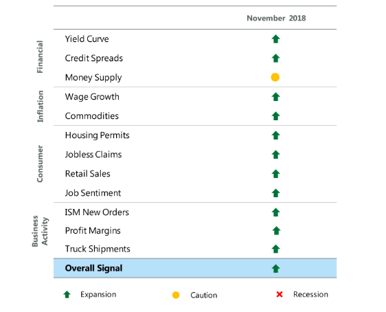
- Currently, 11 of the 12 indicators in the Dashboard remain green. While financial markets are beginning to show early signs of strain, no indicators have changed at this time. Business activity and consumer health are showing few signs of stress.
A portion of the Treasury yield curve inverted last week, causing some market watchers to warn of imminent recession risks. While an inversion has preceded the last seven U.S. recessions, we caution investors not to be reliant on one indicator in making investment decisions related to the economy.
For one thing, the timing of a recession following an inversion can vary widely and is difficult to predict. We developed the ClearBridge Recession Risk Dashboard to help us monitor the economy across 12 indicators. We chose these after studying the indicators that, in aggregate, were most predictive of economic distress.
ClearBridge Recession Risk Dashboard
Source: BLS, Federal Reserve, Census Bureau, ISM, BEA, American Chemistry Council, American Trucking Association, Conference Board, and Bloomberg.
At present, 11 of the 12 ClearBridge Recession Risk Dashboard indicators we track remain green (with one yellow). While the yield curve has flattened and credit spreads have widened, both remain green at this time. Both indicators are part of the financial markets section of the dashboard, while the portions of the dashboard that focus on the “real” economy remain healthy. Put differently, consumer health and business activity are showing few signs of stress, while inflation remains in check. As the economic cycle continues to mature, we would expect the dashboard to worsen, and importantly would be looking for a broadening of stressed signals beyond just financial market-related ones.
In some ways, this reminds us of 2006. We believe that studying the progression that led up to prior recessions can give investors a better appreciation of how a recession can develop. We continue to view near-term recession risks as low and believe that exiting equities based on one negative economic indicator is not a prudent move.
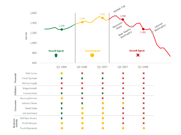
The Great Recession is America’s most recent recession, and it is often considered the worst crisis since the Great Depression. As with all previous recessions, there were several warning signs. First was the inversion of the yield curve in December 2005. Then, in January 2006, fearing an asset bubble, Federal Reserve Chair Ben Bernanke raised interest rates. This worsened the situation. In April that year, Bernanke gave a speech to the House of Representatives, explaining that based on mortgage and job creation rates, the Fed expected markets to undergo a “gradual cooling rather than a sharp slowdown.” In July 2006, the federal-funds rate increased to just over 5% and the yield curve, which had normalized after inverting the previous December, inverted again. In September 2006 the Dashboard’s Yield Curve indicator changed from yellow to red.
Exhibit 2: Recessions Can Take Time to Develop
Source: BLS, Federal Reserve, Census Bureau, ISM, BEA, American Chemistry Council, American Trucking Association, Conference Board, and Bloomberg.
Perhaps the most crucial catalyst was the housing market bubble; in the years leading up to the most recent recession, hedge funds made investments in mortgage-backed securities, many of which had subprime ratings. As homeowners defaulted on their mortgages, large banks began collapsing, and with them the global economy that relied on them. In September 2006, the Dashboard’s Housing Permits indicator turned from yellow to red, and Job Sentiment changed from green to yellow. That October, the ClearBridge Recession Risk Dashboard’s overall signal changed from green to yellow, beginning a cautionary period.
It's instructive to note that from a weaker period in mid-2006 when four indicators were yellow and two red, it took another six quarters for recession to start. Today’s economic landscape is healthier, with just one yellow indicator through November, suggesting the next recession will likely take time to develop.
Regarding present conditions, it is worth noting that an inversion did occur between three and five-year Treasury notes. All inversions are concerning because they generally indicate stress in the bond market. However, the importance of the signal relies on two things: 1) the maturity differential between bonds; and 2) the depth of the inversion. Regarding the first condition, the greater the differential between maturities, the greater the stress it indicates. An inversion of the 1-year/10-year curve would be more important than the 3-year/5-year, for example. Investors usually want more compensation the longer they go out on the curve, and if they are willing to accept less yield to take on more duration risk, it indicates that something negative is likely to occur to hurt economic activity and inflation. As a reminder, our dashboard focuses on the 3-month/10-year curve.
In addition, the deeper the inversion, the more likely an economic or market event is to occur. While the 3-year/5-year modestly inverted on December 3rd, it is basically flat at the time of writing. Given these two dynamics, we believe the recent inversion is not the harbinger of economic weakness portrayed in the media.