
Here Are The Most Important Stock Charts To Watch This Week
After the sharp 12 percent stock market rout over the past two weeks, the big question on everyone’s mind is “where are we heading next?” In addition, as someone who is known for warning that we’re in a gigantic bubble, many people are asking me “is this the peak of the bubble?” Though I rely on fundamental information such as valuations to help determine if a market or asset is experiencing a bubble, I believe that technical or chart analysis is necessary when dealing with market timing-related questions. In this piece, I will show the most important stock charts that I’m watching to help determine if a bounce is ahead or if another leg down is likely.
Starting in September 2017, the U.S. stock indices went parabolic and climbed a succession of steepening uptrend lines. The correction of the past two weeks caused the Dow to slice below the two most recent uptrend lines that formed in September and November 2017, respectively. This represents a notable technical breakdown that investors and traders should be mindful of. At the same time, the longer-term uptrend line remains unbroken, which means that the longer-term trend is still intact for now. In the near future, the Dow is likely to bounce around and form a consolidation pattern between the most recently broken uptrend line and the unbroken longer-term uptrend line as it works off its oversold condition.
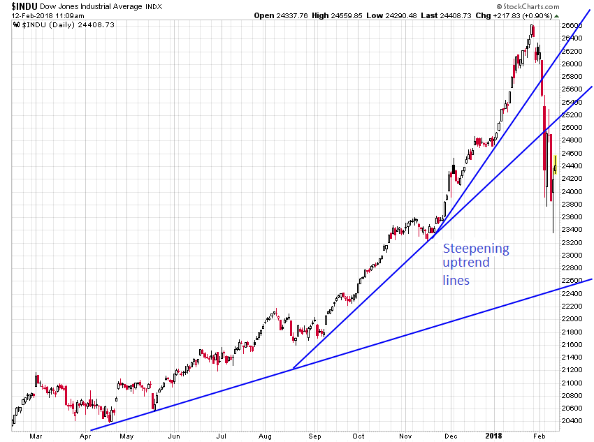
Source: StockCharts.com
The weekly Dow chart shows how the most recent uptrend line was broken, but the other two uptrend lines are unbroken. My level of concern will rise proportionately with each major uptrend line that is broken.

Source: StockCharts.com
After plunging below the two most recent uptrend lines, the SP500 found support at the longer-term trendline on Friday. There is a very high likelihood that the SP500 will bounce around in between these trendlines for now as traders digest the implications of the recent downdraft.
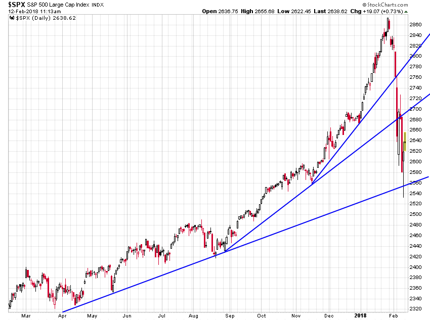
Source: StockCharts.com
The weekly SP500 chart shows that the longer-term uptrend line that started in early-2016 is still intact. If this were to break, it would give another bearish confirmation signal.

Source: StockCharts.com
The tech-heavy Nasdaq also broke below its most recent uptrend line, but found support at its longer-term uptrend line.
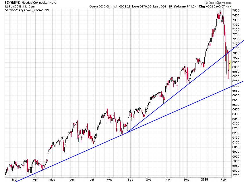
Source: StockCharts.com
The weekly Nasdaq chart shows how the trendline that began in early-2016 is still intact.
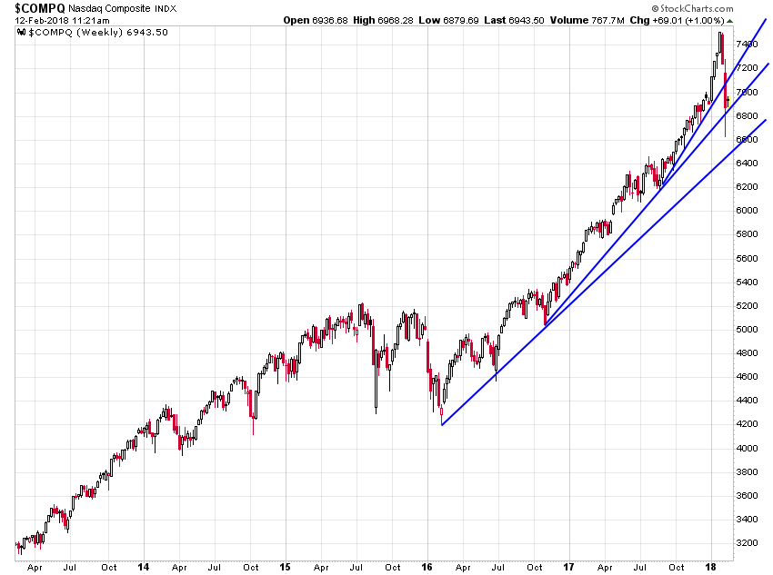
Source: StockCharts.com
After a brief breakout above the 1,550 level that I was watching, the small cap Russell 2000 cut right below that level and the uptrend line that started in August 2017.
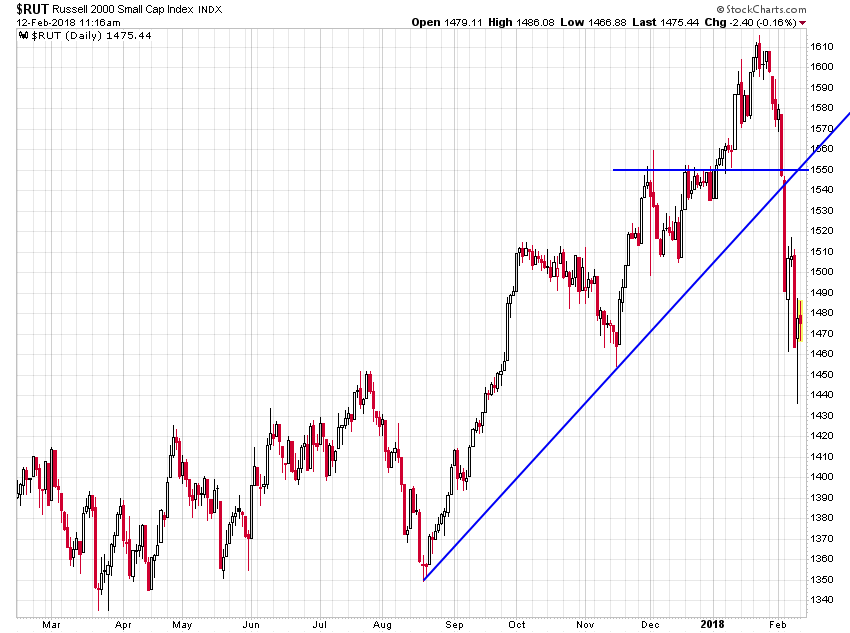
Source: StockCharts.com
The weekly Russell 2000 chart shows that the index has been rising within a channel over the past two years and that the uptrend is still intact as long as it stays within this pattern. The index briefly fell below the bottom of this channel on Friday, but was able to regain this level by the close of trading.
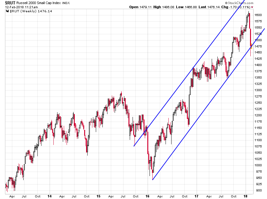
Source: StockCharts.com
For now, there is a high probability that the major U.S. stock indices will consolidate after such a powerful downward move. Once the current oversold conditions are worked off, the next directional move made will be very important from a technical signal standpoint. If the market breaks below the longer-term trendlines discussed in this piece, it would be quite worrisome. On the other hand, if the indices are able to rally back above their broken trendlines, it would negate the recent bearish signals.
(Disclaimer: All information is provided for educational purposes only and should not be relied on for making any investment decisions. These chart analysis blog posts are simply market “play by plays” and color commentaries, not hard predictions, as the author is an agnostic on short-term market movements.)
RSS Import: Original Source
