
Chart of the Week - Bond Yields and Inflation
Treasury Yields and the Long-Term Rate of Inflation: A lot of people have gotten excited about the surge in annual inflation rates, but in my view it’s arguably more interesting to look at the 10-year compound annual growth rate of CPI (long-term inflation rate) — particularly as it pertains to bond yields.
Typically bond yields follow the growth/inflation pulse, with a particular emphasis on growth in the shorter-term. But as we can see in the chart below, bond yields over the longer-term trace a fairly similar path to the longer-term rate of inflation.
Arguably the current move in bond yields has more to do with inflation than growth. Perhaps even to the extent that we could end up seeing growth momentum falter (as the leading indicators suggest ), but still see bond yields move higher given the permanent bump to prices and lingering effects on the longer-term rate of inflation.
In terms of the “so what?“ — if we were to take this chart literally, US 10-year treasury yields would need to rise to around 4.5%+ to line up with the current and expected pace of this longer-term inflation rate…
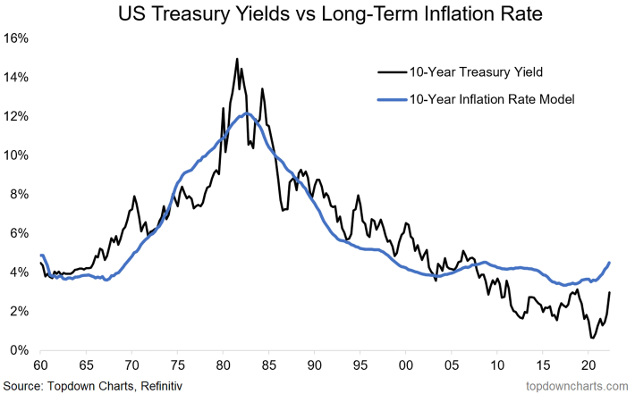
Key point: With an increasing fixation on inflation bond yields could go higher yet.
NOTE: this post first appeared on our NEW Substack: (VIEW LINK)
Best regards,
Callum Thomas
Head of Research and Founder of Topdown Charts
Follow us on:
LinkedIn (VIEW LINK)
Twitter (VIEW LINK)